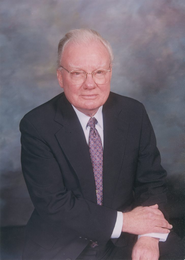
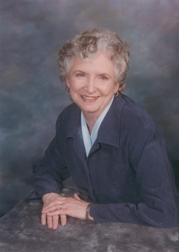
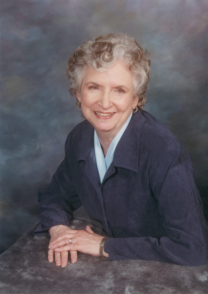
Portrait Scan, Color Balancing, and Print Matching
Background/Context
Role: Head Digital Artist & Retouching Specialist
Tools Used: Epson V700, Photoshop, Lightroom Classic, Epson P9000
Company: Omega Photo
Overview
Process
Scanning and Initial Adjustments
I began by scanning both original photographs and reviewing how the images compared in contrast, color density, and skin tone.
After scanning, I increased contrast and overall color density so the two portraits felt more aligned visually.
Skin Tone Balancing
One of the more challenging aspects of this project was addressing skin tone differences. The father’s image became noticeably red once contrast was added, while the mother’s skin tone had more of an olive undertone. Since everyone’s skin tone is naturally different, the goal was not to make them identical, but to reduce the redness in the father’s portrait so the two images felt balanced when viewed side by side.
Using Lightroom Classic, I masked the father’s face and skin to selectively reduce redness without washing out his complexion or making the image look unnatural. This required careful adjustments to avoid overcorrecting while still meeting the client’s expectations.
Print Preparation
Results and Reflection
The final prints achieved a cohesive look that allowed the portraits to be displayed together comfortably. This project highlights my ability to make nuanced color correction decisions, manage challenging skin tone differences, and balance technical accuracy with client preferences.